Figma variables are the backbone of modern design systems: they turn one-off decisions (colors, spacing, copy, booleans) into reusable tokens that update across your files with a single change. At Fabrikate, variables are how design work stays scalable across brands and platforms while still feeling tailored to each client.

Why Variables Matter (And Why Fabrikate Cares)
Variables in Figma store values like colors, numbers, strings, and booleans so designers can work with meaningful names instead of hard‑coded values. Think of them as your design system’s “single source of truth” for everything from button colors to spacings.
At Fabrikate, this matters because projects often span multiple touchpoints, brands, and iterations, and a variable-driven system lets the team adjust themes, spacing, or typography for entire product journeys with minimal rework. This fits directly with our focus on durable design systems and prototypes that can evolve over time instead of being rebuilt from scratch.
How Figma Variables Work
In Figma you can group variables into collections (like “Colors” or “Spacing”), and each collection can have multiple modes to represent different contexts such as light/dark, desktop/mobile, or brand variants. Within a collection you define individual variables by the following types: colors, numbers, strings, or booleans. Then you bind them to properties like fills, borders, texts and other component properties. Be sure to use variable scope to set a specific variable for each property dropdown. This ensures that you have a focused list of variables to select from.
Modes allow you to effortlessly switch an entire frame, component, or page from one setting to another, such as from "Light" to "Dark" or from "Brand A" to "Brand B" with just a single toggle. This will adjust the colors and other attributes to match the selected mode.
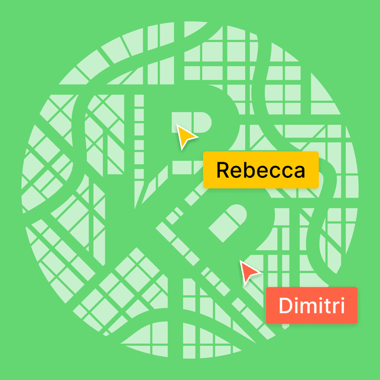
In prototypes, variables can also be changed via interactions (“Set variable”) and combined with expressions to handle things like dynamic labels, counters, prices, or conditional UI flows.
Our Variable Architecture
When embarking on a new project, we begin by categorizing our variables into two distinct groups: primitives and semantic tokens.
Primitives represent the fundamental elements that form the foundation of our design system. This includes essential components such as base colors, spacing measurements, and typography scales.
On the other hand, semantic variables serve a different purpose; they take these raw building blocks and assign them meaningful roles within the design. For instance, a semantic variable might define a color as 'Background/Button/Primary/Default' or designate a text color as 'Foreground/Default'. This structured approach not only enhances clarity but also ensures consistency throughout the project.

Best Practices You Can Steal
- Start with a clear naming system that separates primitives (Colors/Brand/green-500) from semantics (Colors/Background/Button/Primary/Default).
- Set variable scope (e.g. “stroke only” for stroke colors) so designers see only relevant variables in each property dropdown.

- Keep primitives and semantics visually separate in names and avoid ever using primitives directly in components. For instance, we limit the visibility of all primitives across every property by deselecting every property in the scope settings. This encourages our designers to leverage semantic values and make the most of variables.
- Keep collections focused (e.g. Colors, Spacing, Typography) and avoid dumping everything into a single catch‑all set.
- Use modes for real context switches only (themes, brands, platforms), not minor stylistic tweaks, so mode changes feel meaningful and predictable.
- Bind variables everywhere the UI supports them: frames, auto layout, grids, effects, typography, and components. This maximizes the benefit of global updates.
By treating variables as the foundation of every design system, we can deliver prototypes and interfaces that are both highly customized and easy to maintain across years of product development.